Green Door Project
Director, Brand Strategy & Design
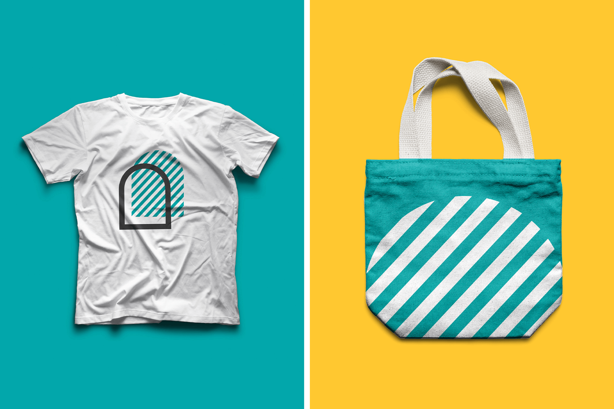
Green Door Project was established as a national oral healthcare advocacy and awareness initiative by Green Shield Canada (GSC), rooted in the foundational belief that equitable access to oral healthcare can lead to a better and healthier future for all Canadians. In consultation with client I worked with strategy and design teams at Jacknife Design to develop a brand intended to reach a wide, national audience through marketing campaigns, media coverage, and high visibility partnerships, designed with the flexibility to be used across a wide range of touchpoints from a mural to a mobile oral care bus. Green Door Project had to convey a serious urgency yet be positive in tone. We worked with illustrator Karolina Ficek to bring her drawings to life and introduced the brand in an explainer video for the launch. Deliverables also included brand positioning, logo, identity system and brand standards. Playing off the notion of filling a significant gap in the national healthcare system with its complexity of related issues, the use of simple shapes, colour, textures, patterns, and accessible language that’s informative as well as warm and welcoming creates a brand framework that invites awareness, dialogue, and action.